Shaun Tan’s books are beloved in Australia and around the world. His stories resonate deeply with readers of all ages, combining suburban familiarity with quiet surrealism and emotional depth. When Sydney’s Flying Bark Productions began adapting Tales from Outer Suburbia for television, it was important to the studio that the visual language of the series honoured that legacy. At the same time, stylistically it needed to sit apart from other productions created at Flying Bark.
For Shaun, it was important that the series felt true to the tone of his work – reflective, minimalist, surreal yet grounded in everyday Australia – while also exploring how those ideas could expand stylistically in a television format. The ambition was to deliver something cinematic and high-end, yet achievable within the realities of a television schedule and budget.
Establishing the Style
Series Director Noel Cleary explains how the award-winning production company produced a premium stop-motion look created entirely in CG.
“Our visual development began with Shaun’s paintings. He is a prolific artist, and his body of work gave us a wealth of reference – particularly the way he handles light across different times of day in Perth’s suburban environments. His paintings often have realistic directional lighting, muted palettes, and eerie compositions that feel comforting. We studied how he layers colour and atmosphere, and used that as our tonal foundation.”
Noel Cleary, Director

“I’ve always loved stop motion, and wanted the series to feel like photographed puppets on a miniature stage. Our VFX Supervisor, Anders Thönell, had long wanted to explore that territory as well, so together we began planning a visual starting point for the team.”
Noel Cleary, Director
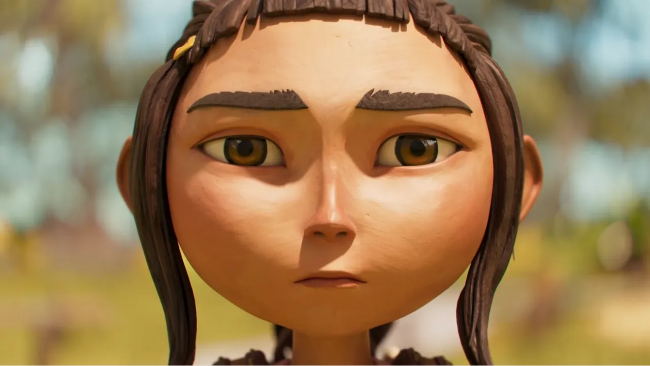
Scale became crucial. The thickness of materials, the proportions of props and the physical logic of a puppet world all needed to feel believable. Real stop-motion reference was studied to determine how fabrics bunch, the oversized thickness of stitching and seams, and how buttons and zips are often scaled up for readability. Hair was treated as solid sculpted forms, like shaped clay, to remain within budget limitations while focusing on strong shape language. Eyes were designed to appear hand-painted, complete with visible brush dabs in the pupils and subtle glue smears on the eyebrows. Every detail was crafted to look tactile and handmade, even though all assets were created in CG.
Cinematography
Shot Flow

Immersing the audience into the storytelling is crucial, and camera language plays an important role in this.
“Rather than relying on traditional over-the-shoulder coverage, we planned cameras around direct point-of-view shots and strong, centred compositions. Maintaining a consistent centre-frame discipline from shot to shot created a subtle visual rhythm that supported the tone of the stories.”
Noel Cleary, Director
Intimate character shots were punctuated by wide reveals of the set, reminding the audience of the miniature scale of the world. Abstract visual motif shots were also incorporated to foreshadow narrative beats and propel emotional storytelling.

Hiromi Kakinuma led the story team in embracing this approach. Although it differed from the studio’s usual shot flow and required time to establish cinematic rules, the team delivered nuanced boards. Editors Adam Rainford and Jon Tappin refined tone and rhythm in every sequence. Tom Pickford and the layout team then built upon that foundation, elevating the camera work while preserving the original intent.
Lighting

Lighting was equally critical. The goal was to backlight as much as possible using simple, practical solutions without artificial “cheating.” Sets were designed with lighting in mind: windows were positioned opposite blank walls to cast daylight, serve as cool light or darkness at night, or act as reflective surfaces for narrative purposes. Curtains of varying thicknesses diffused and controlled light intensity.

Practical lights were placed on all interior walls to allow lighting control wherever a character stood. Props were positioned to provide bounce light, and highly reflective materials were incorporated to create bokeh in long-lens shots, such as the bank of trolleys outside Esme’s Underpass.
“We lit sets according to time of day rather than per sequence, which allowed more time for Vishal Sanghani and his team to refine their setups and achieve a richer, more realistic result. That decision gave the final images depth and cohesion, while keeping us within budget.”
Noel Cleary, Director
Production Design
Characters
Art Director and Character Designer Thomas Campi brought a striking graphic sensibility shaped by his background in comics. He translated briefs into distinctive designs balancing stylisation with emotional clarity. Throughout the project, Tan provided feedback on major assets to ensure they felt sculptural and iconic while remaining grounded in the everyday world he had created.
Surfacing artists then undertook the challenging task of making CG assets feel like handmade, photographed puppets. Vishwesh Taskar led much of the initial surfacing work on the hero character, establishing a template that could be rolled out across the cast.

Environments and Props

Set in 1980s, pre-internet suburban Australia, the series required detailed design of houses, streets and backyards from the era to build authenticity. Simultaneously, everything needed to feel distinctly part of Tan’s world – special yet mundane depending on perspective.
Cars became central to the visual recipe. Their shapes anchored the time period, while glossy surfaces contrasted deliberately with the softer, subdued surfacing of environments. At night, they functioned as animated light sources. The design team, alongside modelling and surfacing teams led by Sean Pow and CG Supervisor Natalia Gubareva, developed creative solutions to ensure every asset adhered to the puppet aesthetic.

Digital Matte Painting (DMP) and Set Extensions
Skies played a key role in establishing time of day and enhancing emotional impact through weather and colour palette. Painterly yet highly detailed digital matte paintings heightened drama while supporting the stop-motion set aesthetic by embracing, rather than disguising, its artificiality.
FX
FX also needed to belong within a stop-motion universe. FX Lead David Tonkin and his team conducted early tests to establish timing and behavioural language for dust, smoke and water. A unified shape language was developed — altering scale and surfacing to differentiate materials while maintaining consistent handmade qualities.
Animating a Puppet World
Stop-motion puppets possess a charm born from limitation – slight stiffness, incremental movement and the tactile sense of physical posing. Working with Animation Director Les Turner, the team developed techniques to capture this quality across characters and props. Each asset followed behavioural rules while remaining cohesive within a shared world.
The animation team at Digitoonz applied meticulous care to every shot, ensuring even the smallest gestures retained a crafted, frame-by-frame sensibility and nuanced performances conveyed story and emotion.
Multiple Animation styles
From the outset, Tan was keen for the series to incorporate more than one animation medium. Though challenging within a limited series budget and requiring narrative justification, this became an important creative ingredient.
Klara’s sketchbook was used as a device to bring her inner thoughts to life, with animation provided by Studio 247 in Japan and Adam Phillips in Sydney. Imagination sequences and storytelling moments featured hand-drawn 2D animation produced in-house under the leadership of Aline Garcia and Christian Barkel.
Pulling Everything Together
In compositing, supervisors Jay Shadlow and Andrew Buckley and their team unified the final image. Colour and contrast were refined for clarity and emotion, enhancing readability while reinforcing the illusion of physical photography. Subtle lens distortion, pronounced depth of field and bokeh treatments, film grain and even faint flicker reminiscent of 12-frames-per-second stop motion contributed to the finished look.
Teamwork Really Does Make the Dream Work
The project began with a simple but ambitious goal: to create something visually unique that honoured the spirit of Tan’s original tales. Establishing a new style carried inherent risk and required clarity of direction and trust in the Flying Bark team.
“This was a passion project for our entire crew, and what emerged was the result of hundreds of creative contributions, not only from our artists and from Shaun’s guidance, but also our voice cast, writers, editors, sound and music teams, post production teams as well as our producers, production staff and support teams, everyone lent a hand as storytellers all working within the recipe of a defined aesthetic, yet constantly finding ways to elevate it. The final look of Tales from Outer Suburbia is a testament to that collaboration. It’s a world built by many hands, unified by a shared belief in the power of handcrafted storytelling.”
Noel Cleary, Director